DSM & NACL
When I joined Nike Digital Engineering, we had 3 UX designers supporting 16+ products. Every team was building the same components independently — buttons, tables, filters, date pickers — each slightly different, none of them shared. The designs didn't always match what shipped. Engineers rebuilt things that already existed elsewhere. Nobody had assigned anyone to fix it.
So I built the pitch, designed the system, and co-created the infrastructure with Engineering. What became DSM and NACL started as an Apollo efficiency decision and ended up as the shared foundation for how Nike Digital Engineering builds internal tools — across 13+ named applications and 50+ products total.
Role & Scope
- Role: Lead UX/Product Design — self-initiated alongside full Apollo workload
- Scope: Vision, pitch, design system architecture, DSM library creation, NACL co-creation with Engineering, adoption across Nike Digital Engineering
- Partners: Engineering leads, product managers, and development teams across Nike Digital Engineering
- Context: 3 UX FTEs supporting 16+ products in an org still building the case for design investment
The situation we walked into
When I joined Nike Digital Engineering, the UX practice was in early formation: 3 designers supporting 16+ products in an organization still unconvinced of the value of UX investment. There were no consistent design standards across any of the tools. Many projects, owners, and stakeholders — often unaligned. A doing culture that fed the machine without long-term considerations. And a pervasive fear of sudden project death that made it hard to build anything meant to last.
The challenge wasn't just building a component library. It was establishing design as a credible, value-generating function in an organization that had never fully seen what it could do. DSM and NACL were the proof of concept — output that made the argument the words couldn't.
The problem nobody had assigned
The inconsistency wasn't anyone's fault. It was an organizational structure problem. Product teams worked in isolation, each solving the same UI problems from scratch. A button in Apollo looked different from a button in CMS. A date picker in Collections worked differently from one in Monarch. Designers had no shared library to work from. Engineers had no shared components to build from. And every time a designer handed off work to an engineer, the translation introduced drift — what shipped rarely matched what was designed exactly.
- No shared design language across 16+ products — each team solving the same problems independently
- Design-to-engineering handoff consistently introduced visual and behavioral inconsistency
- Engineering time wasted rebuilding components that already existed in other codebases
- No consistent application of UX patterns — teams unconvinced of the organizational value
- 3 FTEs supporting 16+ products with no scalable way to maintain quality at that ratio
The pitch
Before building anything, I needed to make the case. The audience was engineering leadership — people who needed to see a business argument, not a design argument. The framing I used: internal tools power all of Nike's digital e-commerce experiences. They have to be as brilliant as the consumer-facing apps. Our employees deserve tools that don't hobble them.
The vision I set: a consistent experience across all Nike Admin Tools. The mission: beautiful tools that maximize productivity through consistent design, standardized patterns, and reusable components. That framing — productivity and consistency as the value, not aesthetics — is what got the investment.
- Framed the problem in engineering terms: rework, inconsistency, and wasted build time — not design quality
- Proposed a paired system: one library for designers, one for engineers, mirroring each other exactly
- Positioned UXD as the connective tissue between engineering and the end user — not a separate function
- Built executive support before writing a single line of CSS or opening Sketch
The philosophy and the architecture
The system was built on three foundations, layered deliberately:
Google Material Design served as the interaction and component baseline — a proven, well-documented foundation that engineering teams recognized and trusted, which reduced the friction of adoption.
Nike Design Standards sat on top as the brand and visual language layer — ensuring that every component reflected Nike's identity, not just generic Material patterns. The swoosh, the typography, the color system, the iconography — all governed at this layer.
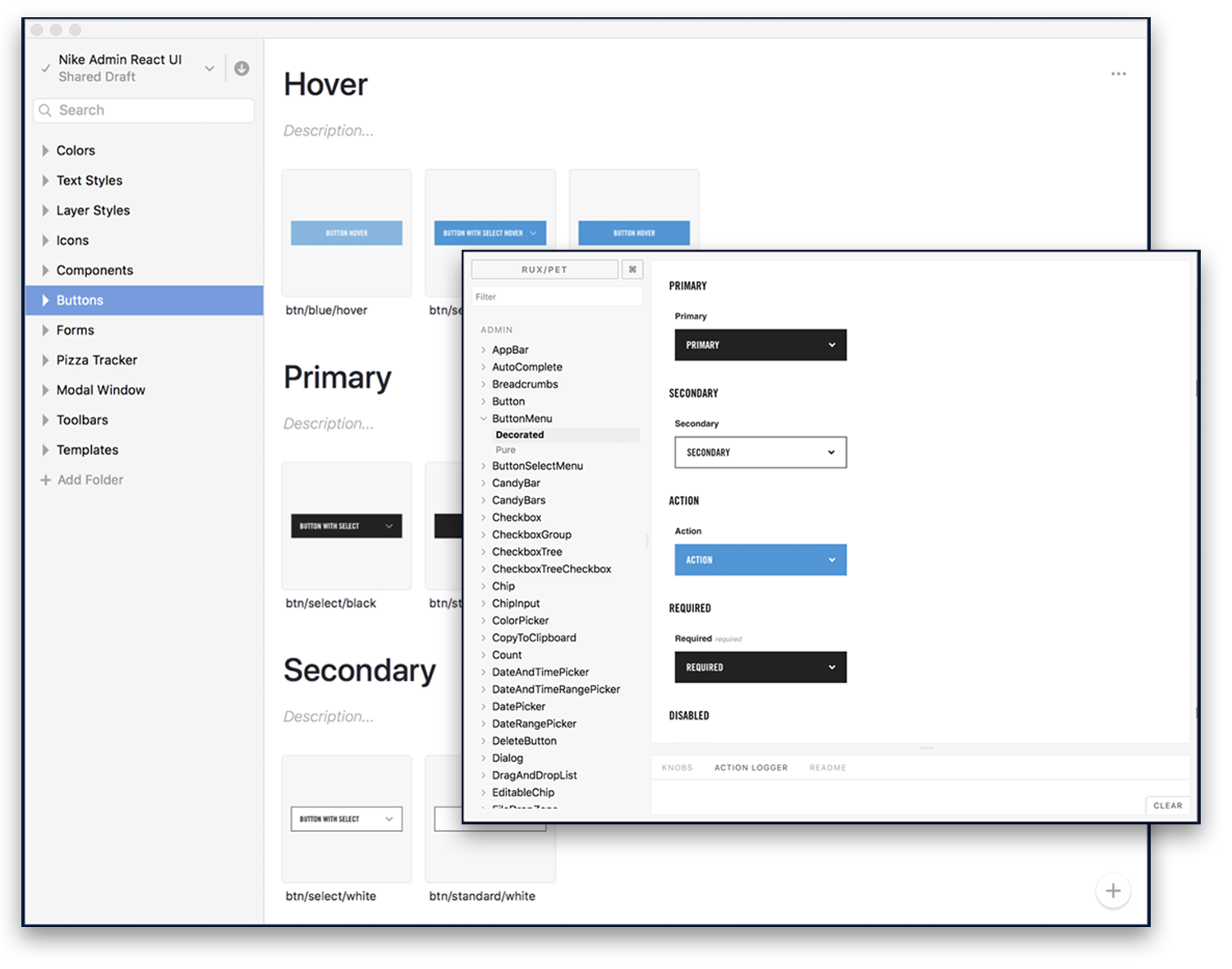
InVision DSM was the shared governance tool that kept both sides synchronized. Designers worked from DSM components in Sketch. Engineers pulled matching React components from NACL. Storybook served as the single living source of truth for both.
The component vocabulary was comprehensive by design: buttons, cards, checkboxes, date pickers, confirmation dialogs, iconography, input fields, menus, modals, navigation, page layouts, and more. Not a minimal viable system — a full enterprise toolkit that teams could depend on rather than work around. Components worked the same way regardless of which application they appeared in, which meant designers could move between products without relearning patterns, and engineers could build with confidence that what they installed matched what the designer intended.
The deeper conviction behind all of it: internal tools deserve the same craft as consumer products. All of Nike's digital commerce experiences are powered by these tools. The people operating them — merchandisers, product creators, operations teams — bring their best every day and deserve experiences as beautiful and performant as anything on Nike.com. They notice when they're not.
Designing the governance
Before a component was built, the governance system had to be designed. What would the page structure look like across CMS, MK, and Apollo? What components would be shared? What interaction patterns needed to be consistent regardless of which application they appeared in? These sessions produced the decisions that made the system coherent at scale.
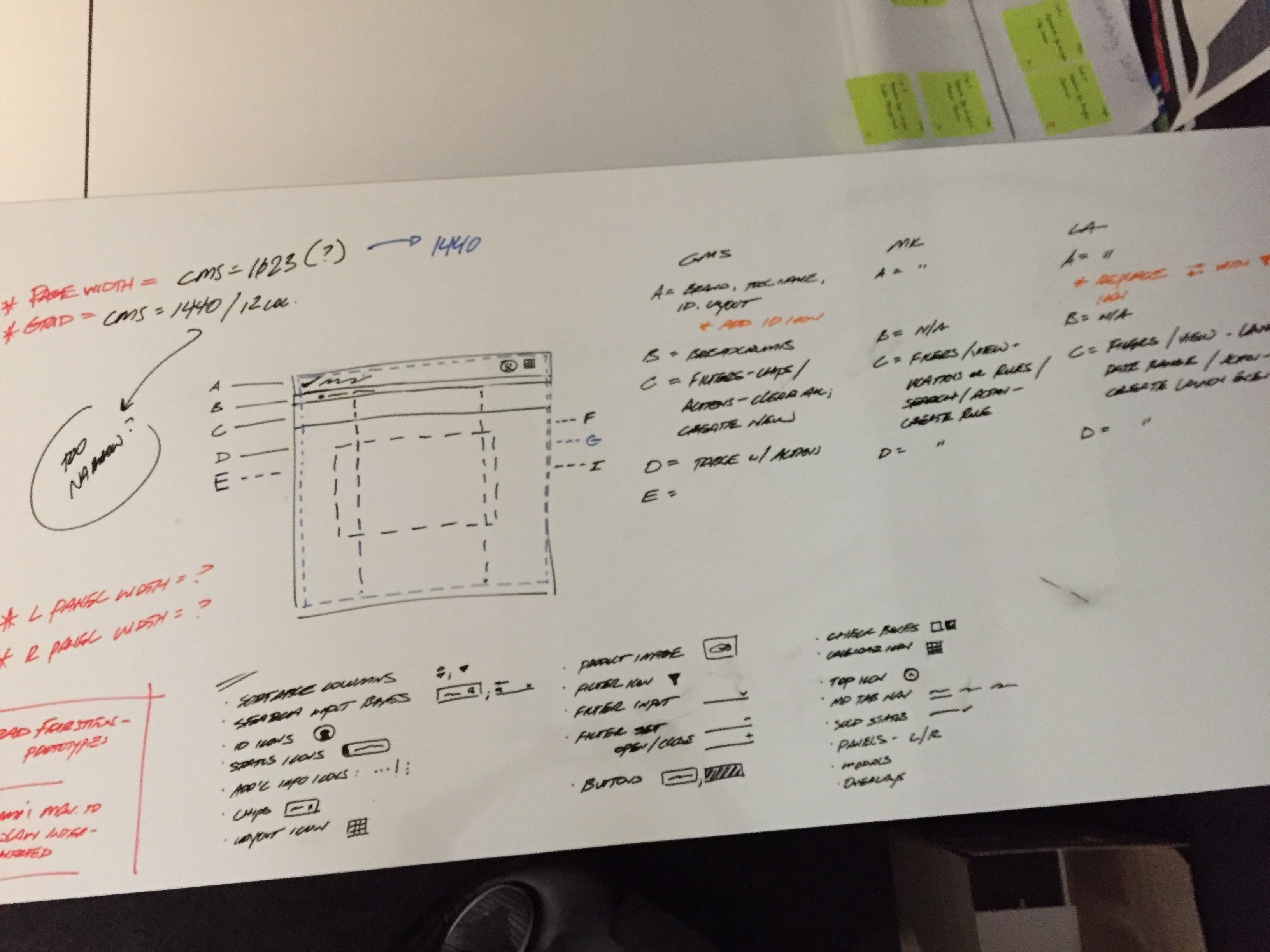
Cross-application layout architecture
The page structure that would apply across CMS, MK, and Apollo — panel widths, column definitions, component zones labeled A through I. The right side maps each zone to the specific components each application would use. This was the governance work: deciding what was shared, what varied, and what had to be consistent regardless of context.
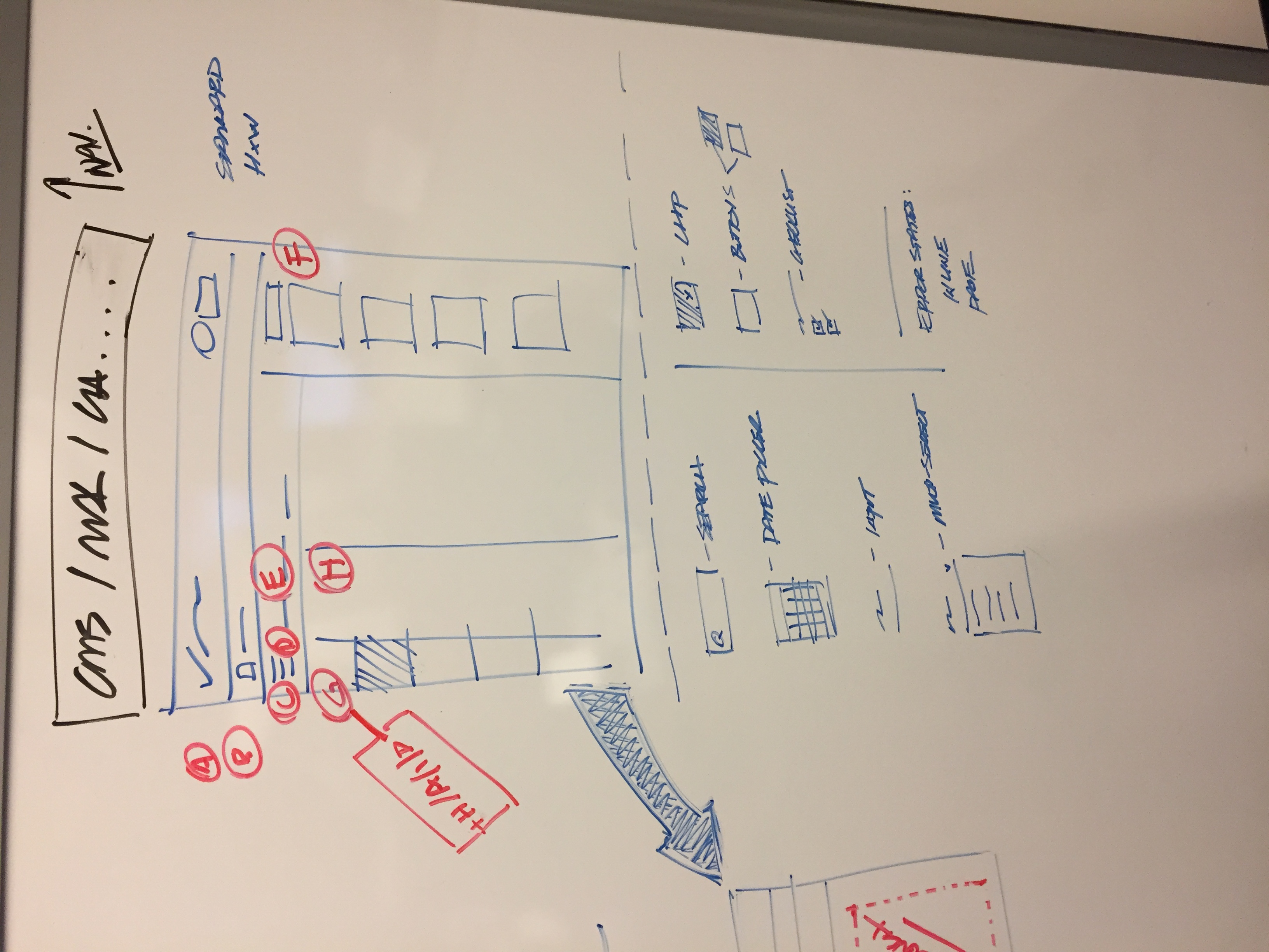
Shared page structure and component inventory
Defining the page structure that CMS, MK, and Apollo would share — and below it, the component vocabulary that would populate it. Every item on this list became a DSM component and a NACL React element. The list preceded the library.
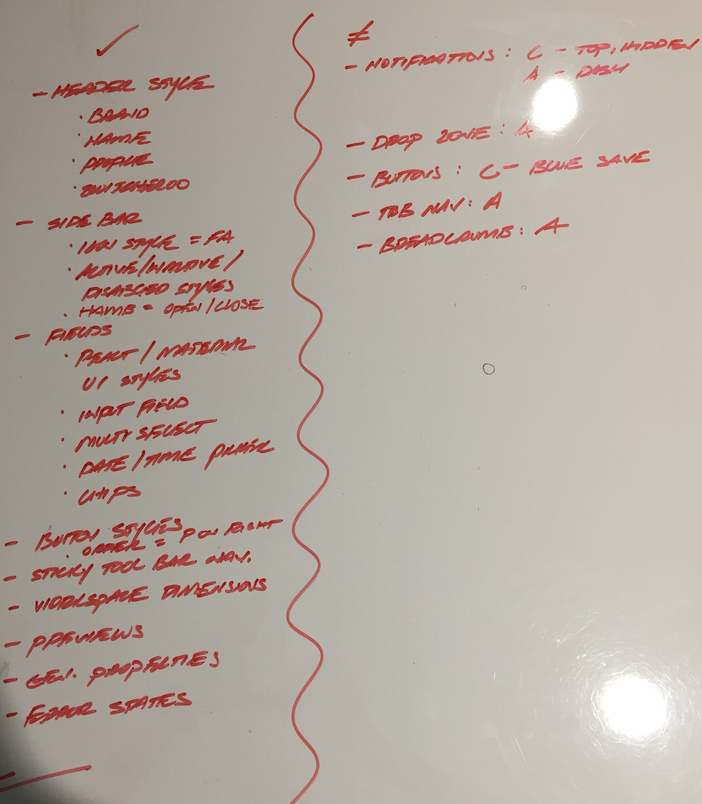
Component specification — what gets built and for whom
The full component vocabulary specified before engineering began — header styles, sidebar patterns, field types, button styles, navigation, error states. The right column assigns each component to the applications that would use it. This document was the contract between design and engineering: build exactly these components, in exactly these variations, and every application gets consistency for free.
What we built
The system had two paired libraries, designed to mirror each other exactly:
The key decision was making them mirrors of each other. Designers dragged components from DSM into their Sketch files. Engineers pulled the matching React component from NACL. Storybook served as the shared living documentation — the single source of truth that both sides could point to. Consistency stopped being something we enforced after the fact and became something built into the workflow itself.
Two libraries, one language
DSM in InVision/Sketch for designers. NACL in React/Storybook for engineers. Designers and developers working from the same component vocabulary — so what gets designed is what gets built.
How it worked in practice
The workflow was intentionally frictionless. A designer opens the DSM library in Sketch and drags a component — a button, a date picker, a data table — directly into their working file. The component is already spec'd, already styled, already consistent with every other product using the same library. When they hand off to engineering, the developer finds the exact same component in NACL, installs it via npm, and builds with it. No translation required. No drift.
- 70+ standard components covering buttons, cards, checkboxes, date pickers, modals, navigation, page layouts, and more
- Starter kit for new engineering teams — up and running with consistent components from day one
- Storybook documentation showed component behavior, variants, and usage in a single living reference
- Components worked the same way regardless of which application they appeared in
- Updates to DSM or NACL propagated across all consuming applications automatically
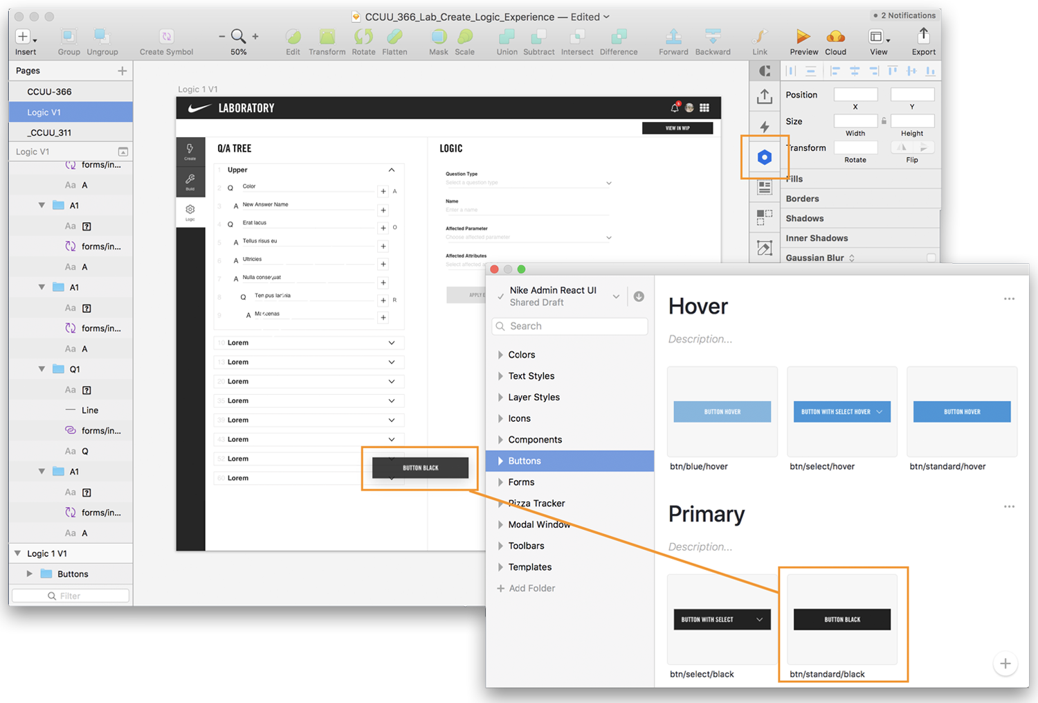
Storybook — The shared source of truth
Every component documented with variants, states, and usage guidance. Engineers install via npm. Designers pull from DSM. Both point to the same reference.
The reach
DSM and NACL didn't stay inside Apollo. Adoption spread across Nike Digital Engineering as teams realized the value of not rebuilding from scratch. The consistent design language meant products that felt like they came from the same company — because they now used the same building blocks.
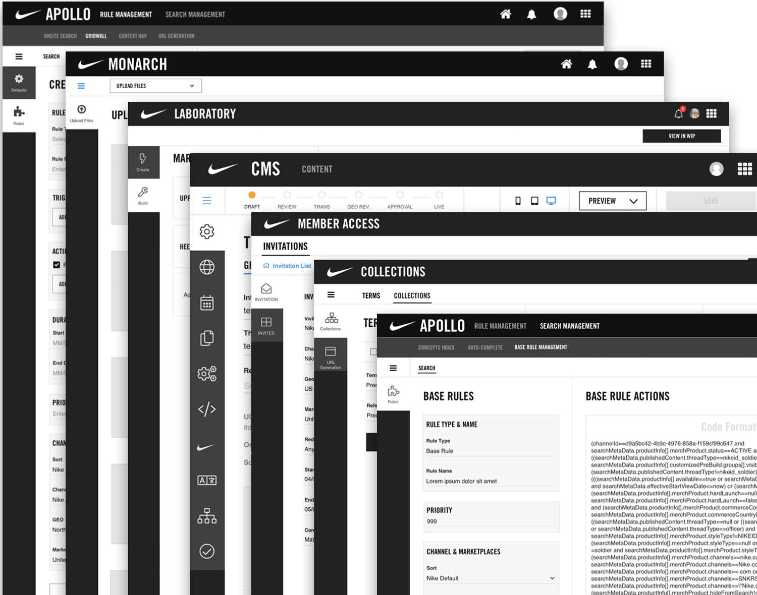
A collection of consistent applications
Apollo, CMS, Collections, Food Court, Lexi, Maui, NID Lab, Pax, Perspective, Search Admin, Monarch, Member Access, Laboratory — and more. Different products, same component foundation.
The pattern underneath
The architecture behind DSM and NACL — a Core component foundation with a Brand Standards layer on top, governed through a shared tool that kept design and engineering synchronized — is the same structural pattern that underlies modern brand management platforms. What we built at Nike was brand governance at engineering scale: ensuring that any team, on any application, was working from the same component vocabulary and brand language, regardless of who built it or when.
The problem Adobe's brand and asset management team is solving is the same problem, at a different altitude and for a different user. The organizational dynamics, the governance challenges, the tension between standardization and flexibility — those don't change. What changes is the context in which people are trying to express and protect their brand.
What it delivered
- Eliminated the class of design-to-engineering handoff drift that had been endemic across the org
- Reduced engineering rework — teams stopped rebuilding components that already existed
- New product teams could onboard to a consistent design language from day one via the starter kit
- Design quality improved across products that had no dedicated designer — the system did the work
- Established UXD as a credible, value-generating function in an org that had been skeptical — through output, not advocacy
What this taught me
Building shared infrastructure in an org that's skeptical of design requires making the value undeniable before asking for permission. The pitch worked because it was framed in engineering terms — rework, consistency, productivity — not design terms. Nobody argues against saving engineering time. The design quality came along for free.
The more durable lesson was about leverage. One designer can only directly influence the products they're working on. But a design system multiplies that influence across every product using it — including products with no dedicated designer at all. That's a fundamentally different kind of impact than shipping another feature.
Born from Apollo, adopted everywhere
DSM and NACL started as an efficiency decision on Apollo and became the shared component foundation across Nike Digital Engineering. The Apollo case study tells the platform story. This is the infrastructure story underneath it.
View Apollo →