MoveWare Athlete Platform
Liquid Wire had built something genuinely new — neoprene knee and elbow sleeves embedded with flexible electronics that gathered more than 600 data points per session, washable and wearable all day. Nothing else like it existed on the market. What they didn't have was a clear picture of what to do with all that data.
I was brought in to help them build it — product strategy through interface design, working alongside their data scientists, biomechanists, and CEO. The challenge wasn't the sensor hardware. It was deciding which of those 600 signals deserved to surface, when, and for whom. That decision is the product.
Role & Scope
- Role: UX Lead / Product Strategist — partnered with an engineer, embedded with client leadership
- Scope: Product strategy, data prioritization, dashboard architecture, real-time monitoring UX, device onboarding, calibration flow, team and group management, injury status views
- My work: Stakeholder research, journey mapping, product direction, data visualization strategy, IA, interaction design, UI design
- Partners: CEO, data scientists, biomechanists, engineering — Liquid Wire / MoveWare
- Users: Sports scientists, coaches, athletic trainers, performance analysts — professional soccer organizations
The real problem
600 data points is not a dashboard. It's a fire hose. Liquid Wire's data scientists and biomechanists understood the signals — knee asymmetry rates, range of motion relative to individual history, load and stress patterns across a training session — but translating that expertise into something a sports scientist or coach could act on in real time, from the sideline, while managing a full squad, was an entirely different problem.
The question wasn't what the data could show. It was what a coach needed to see — and more importantly, what they needed to be able to ignore. Cognitive overload on a sideline isn't a UX inconvenience. It means a warning goes unnoticed. An outlier gets missed. An athlete stays in the session when they shouldn't be.
- No established product direction — Liquid Wire had the hardware and the data but no framework for what to display or why
- 600+ data points required a clear hierarchy: what's always visible, what surfaces on threshold, what stays in the background
- Multiple user contexts — a sports scientist managing 12+ players at once needs different information than a trainer reviewing an individual's session history
- Real-time monitoring in a live training environment is unforgiving — the system had to be fast, clear, and impossible to misread
- Device onboarding had to work reliably every session before a single data point could be captured — Bluetooth pairing and calibration for a full squad, not just one device
Mapping the full workflow — before designing anything
Before any interface work started, I mapped the two core workflows that the platform had to support: getting the squad connected and ready before a session, and monitoring them through it. These journey maps became the shared reference for every product decision that followed.
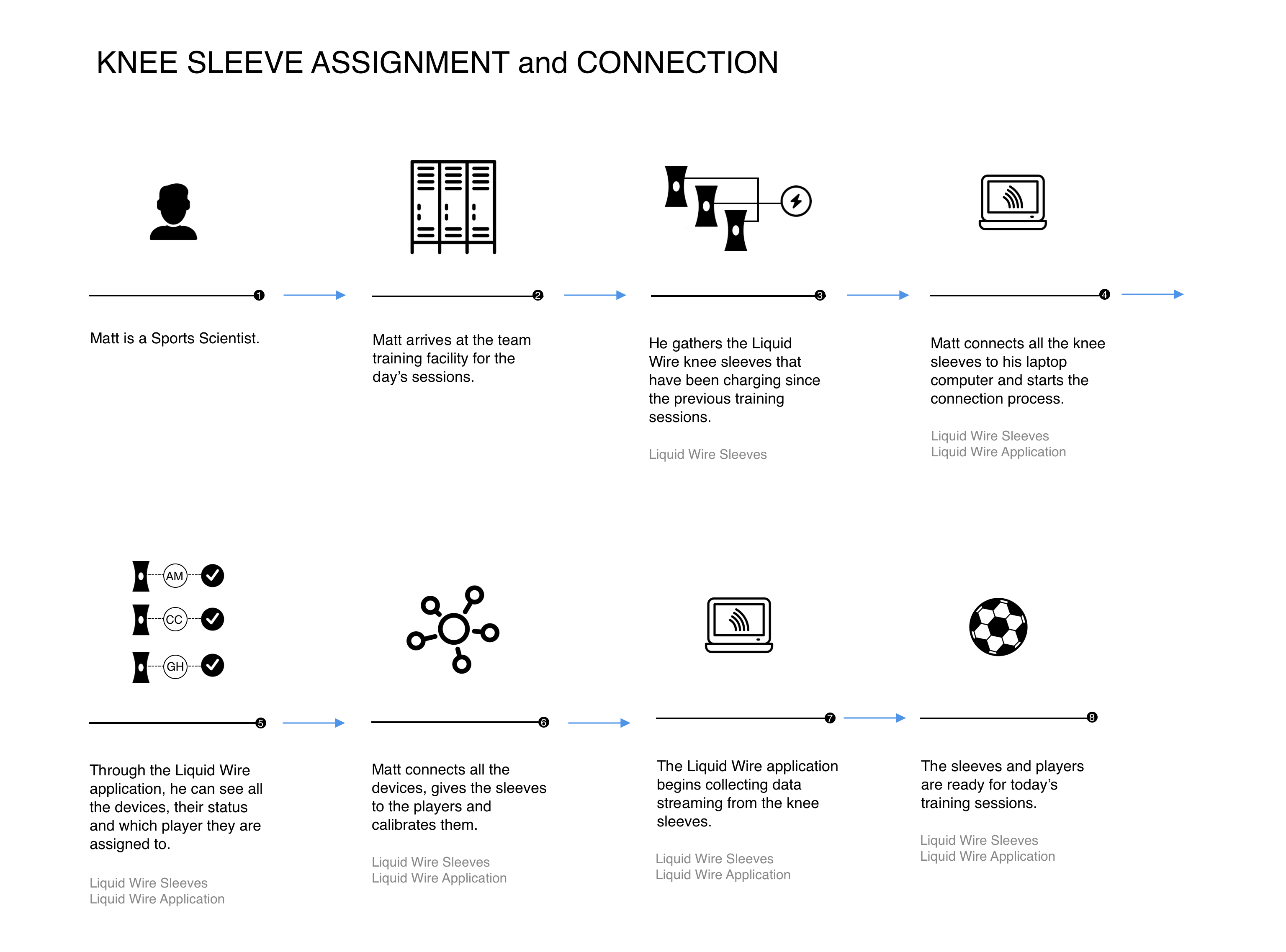
Pre-session flow — Sleeve assignment, connection, and calibration
An 8-step workflow from sports scientist arriving at the facility through to full squad ready for training: collect charged sleeves from storage, connect all devices via the application, assign each sleeve to a player, calibrate, and confirm data is streaming. This flow defined the requirements for the Connection and Calibration screens before a pixel was designed.
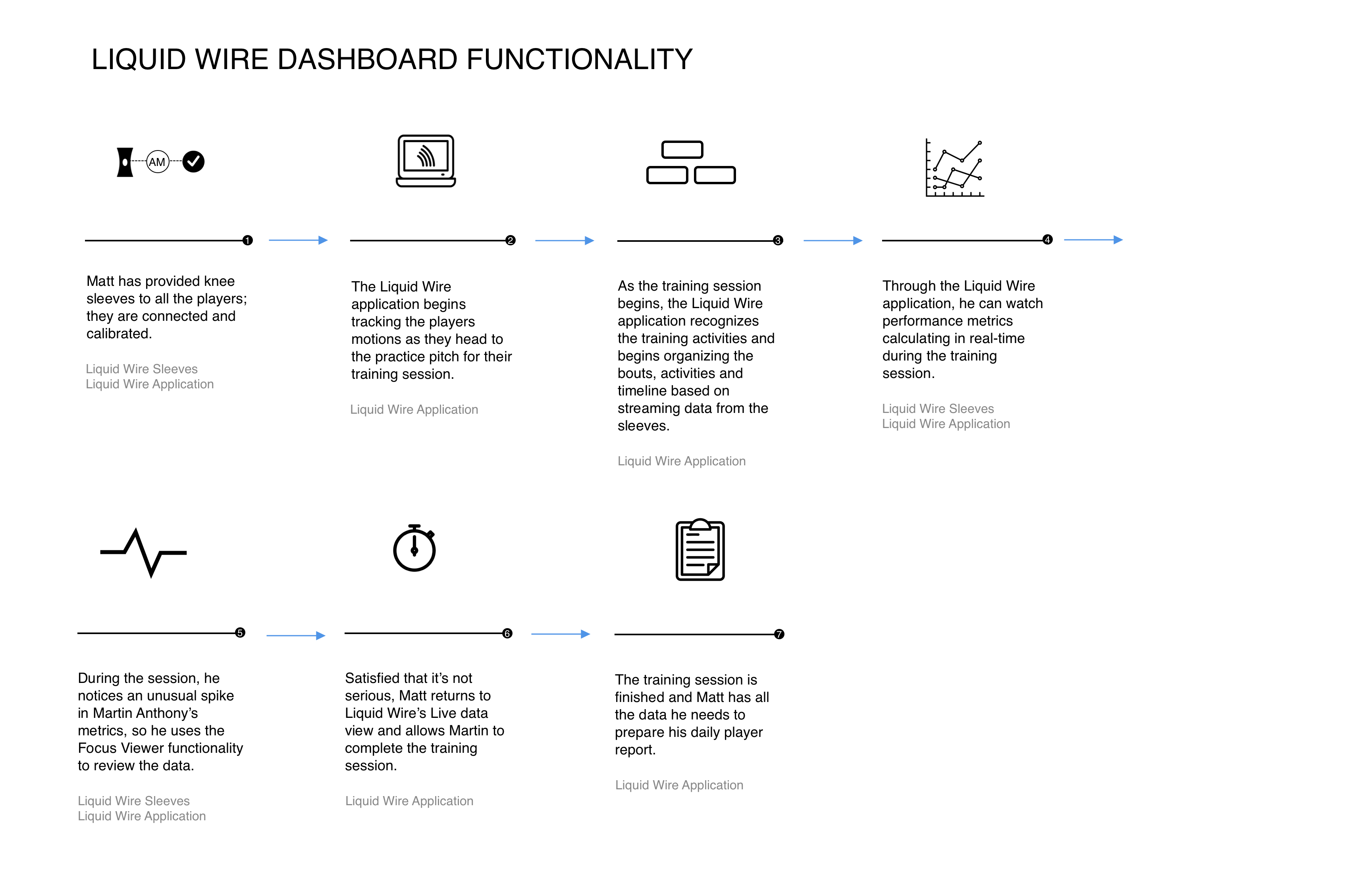
Session flow — Live monitoring, spike detection, and daily report
A 7-step session workflow: sleeves connected, system begins tracking as athletes move to the pitch, activities and bouts auto-recognized from streaming data, metrics calculating in real-time, a spike in one player's metrics triggers a Focus Viewer investigation, the sports scientist clears the athlete to continue, and session ends with all data captured for the daily player report.
How we got there
The mental model I built the architecture around was the financial ticker — but applied to human performance. At the top of the experience, a continuous real-time view: all athletes tracked in parallel, each line showing where they are relative to their personal history and expected range for the current activity. Most lines stay in range. The ones that don't, surface. The entire job of the top-level view is to make normal invisible so the outlier is impossible to miss.
- Defined a three-tier signal hierarchy: always-visible team timeline, threshold-triggered alerts by metric and athlete, deep drill-down for individual investigation
- Designed the real-time timeline as a parallel activity graph — all athletes simultaneously, with bouts and activities automatically segmented from sensor data
- Built Live Team Health gauges: Asymmetry, Load, Step Count, Kick Count — squad-level health at a glance without requiring the user to scan individual athletes
- Designed Team Alerts as a structured alert system: metric name, which athletes are flagged (asymmetry vs. out-of-range), severity level — not a generic notification feed
- Built group management so coaches could monitor by position cohort — keepers, strikers, midfielders — and compare within-group rather than only individual vs. team
- Designed Focus View for drill-down: click any alert to see individual asymmetry charts, left/right ROM comparison, historical average, and standard deviation — at the exact moment it matters
- Designed session comparison: select any prior date, time, and drill type to overlay against the current session — trend analysis without leaving the live view
- Worked directly with biomechanists to determine which of the 600+ signals warranted top-level visibility vs. threshold-only vs. background monitoring
The work
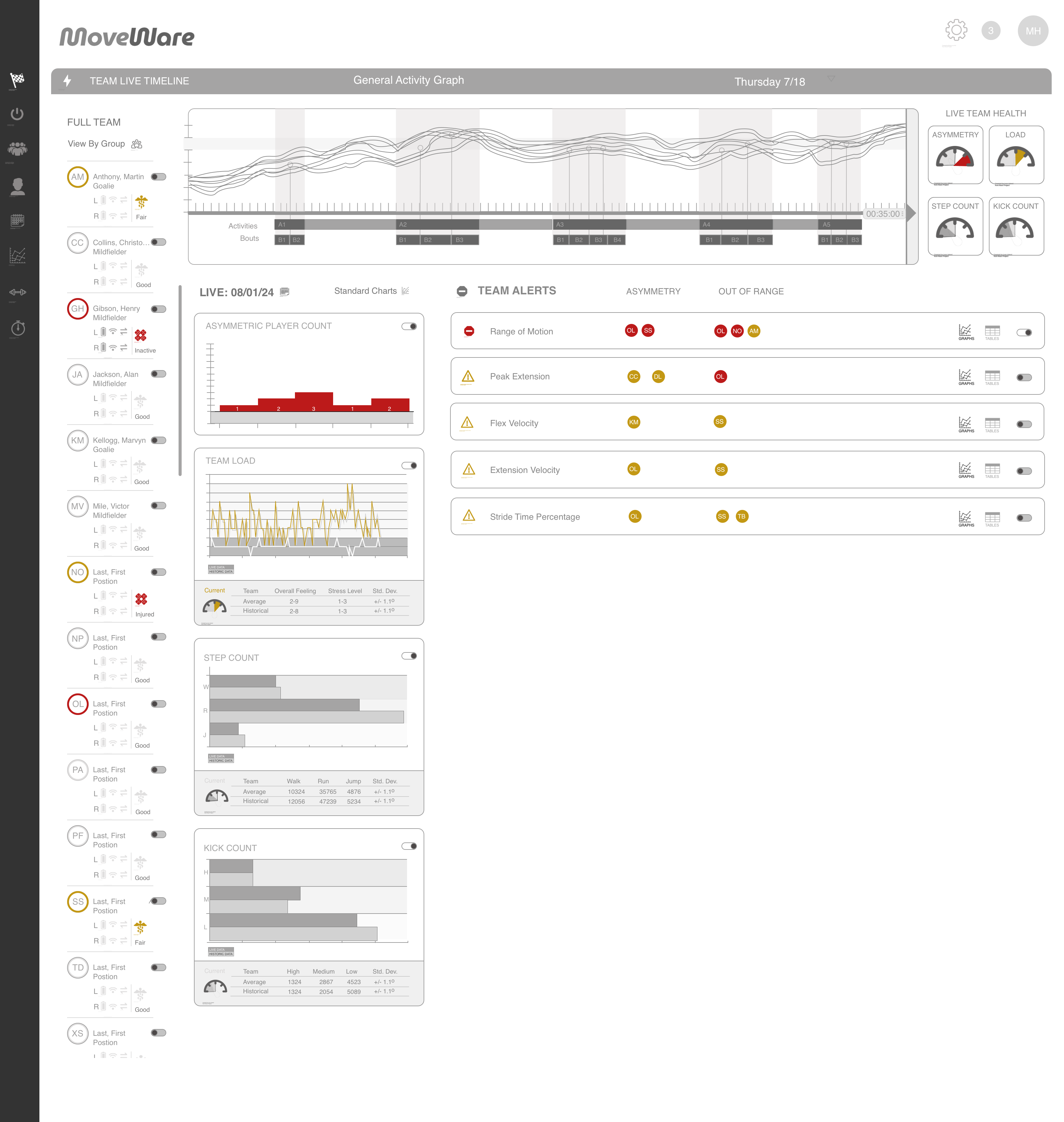
Team Live Timeline — Clean state, full squad monitoring
The primary dashboard. The Team Live Timeline spans the full top — a parallel activity graph showing all athletes simultaneously, with bouts automatically segmented as the session progresses. The athlete roster runs left with per-player status indicators (left/right load, activity level, overall feeling). Live Team Health gauges top-right give squad-level asymmetry and load at a glance. Team Alerts panel right shows clean state — no current flags. The center panels (Asymmetry, Load, Step Count, Kick Count) give metric-level team views with current, average, and historical comparisons. Everything visible. Nothing demanding attention unless it should.
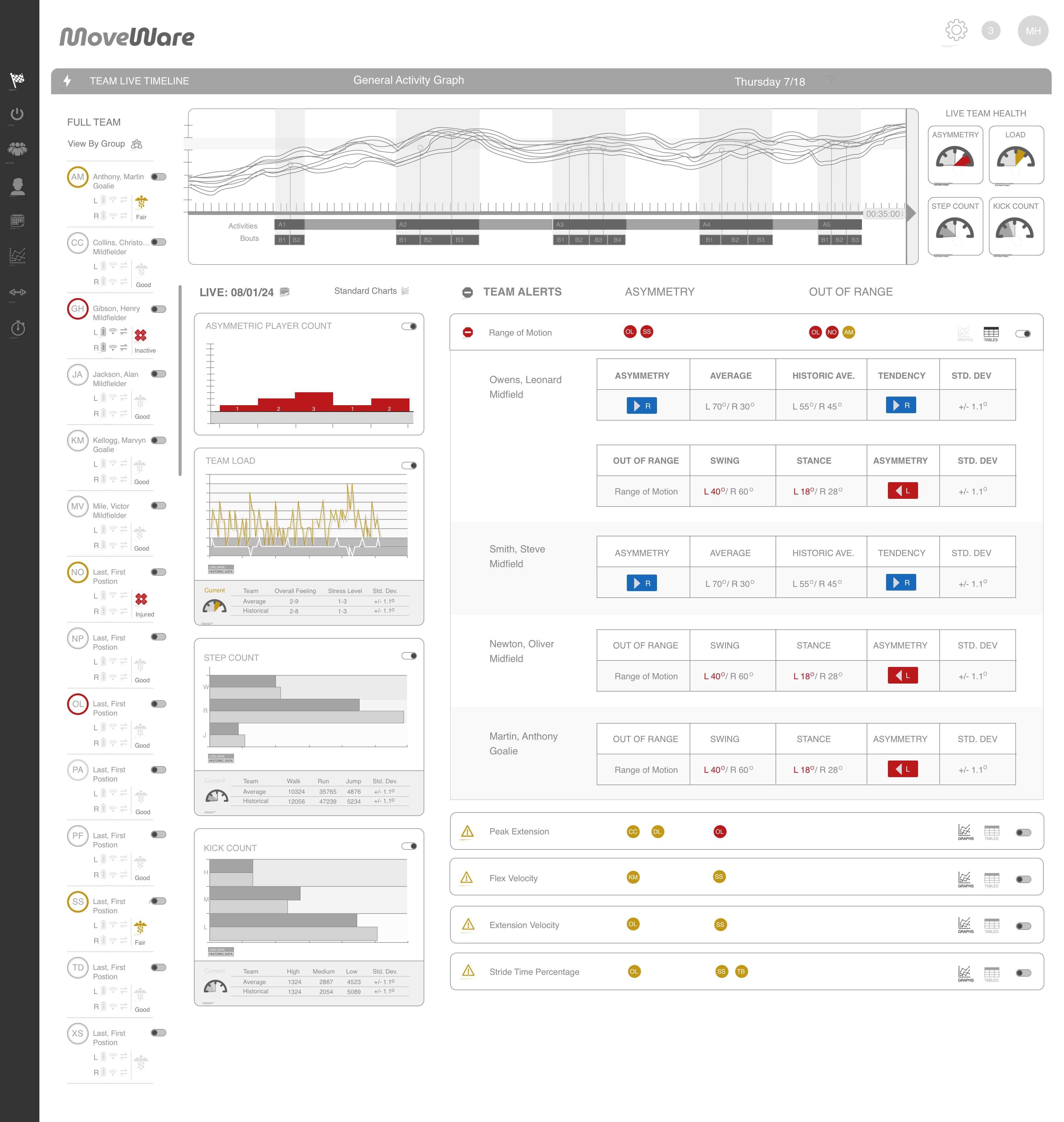
Team Alerts — Active flags with individual drill-down
The same dashboard in an alert state. Team Alerts now shows five flagged metrics: Range of Motion (critical — red), Peak Extension, Flex Velocity, Extension Velocity, and Stride Time Percentage (warnings — amber). Each alert identifies which athletes are flagged by position avatar. Expanding Range of Motion reveals individual player asymmetry charts inline — Owens Leonard and Smith Steve both showing left-dominant asymmetry with current vs. historical comparison. The design decision: alerts are structured, not generic. The sports scientist sees exactly which metric, which athletes, and at what severity — without leaving the main view.
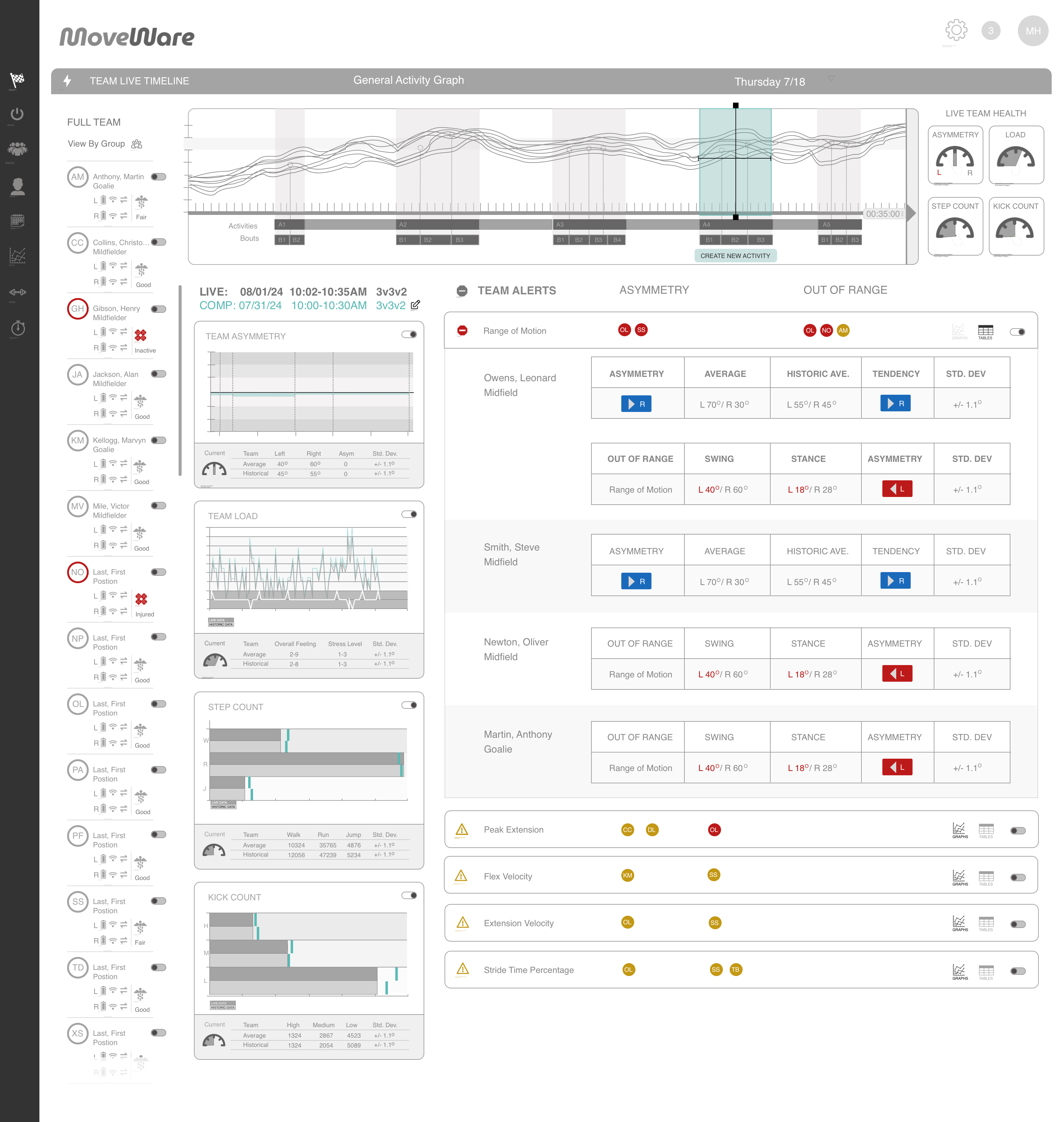
Focus View — Session comparison and activity tagging
Selecting a time window on the timeline activates Focus View — a comparison mode that lets the sports scientist overlay a prior session against the current one by date, time, and drill type. The "Create New Activity" workflow allows tagging specific training segments directly on the timeline as they happen, building a labeled session record in real time. Comparison data appears inline below the timeline — current session vs. selected comparison date, side by side.
Getting 12 athletes connected in minutes
The dashboard is only valuable if the sleeves are connected and calibrated before the session starts. That meant designing an onboarding flow that could reliably handle a full squad — not just one device — without requiring technical expertise from the sports scientist running it.
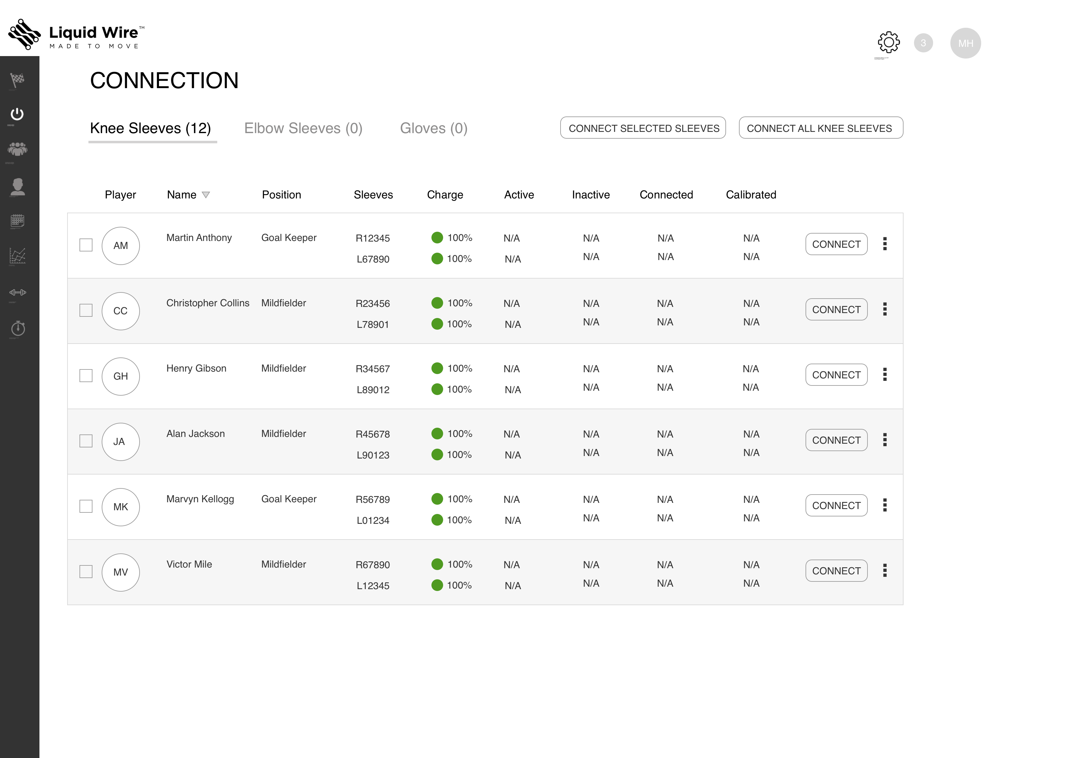
Connection — Squad device management
The Connection screen shows all squad members with their assigned sleeve serial numbers, charge levels, active/inactive status, and connection state in a single table. Bulk actions ("Connect All Knee Sleeves") allow the sports scientist to initiate the full squad connection in one step. Device tabs (Knee Sleeves, Elbow Sleeves, Gloves) handle multi-device squads. Per-row status shows the connection progressing from N/A → spinner → green checkmark as each device comes online. Confirmation toast: "12 devices were successfully connected." Clear, sequential, designed for a pre-session time crunch.
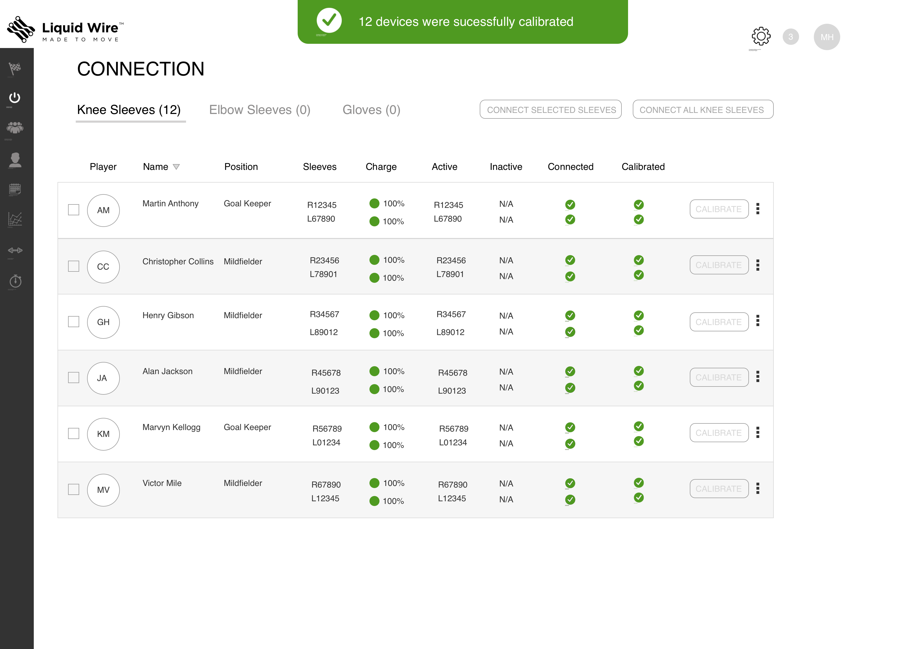
Calibration — Priming each sleeve for the individual athlete
After connection, each sleeve is calibrated to its assigned athlete — the 90° knee bend priming sequence that registers the individual's baseline and confirms the system is reading correctly. The same table structure as Connection, now showing calibration state column with spinners per athlete as calibration completes in sequence. Confirmation: "12 devices were successfully calibrated." The consistency between Connection and Calibration screens is intentional — same mental model, same interaction pattern, two steps in the same pre-session workflow.
Where the project landed
The design was completed and validated against the journey maps and biomechanist requirements. Next steps were field testing with wired-up hardware while the software build continued in parallel. The hardware team was simultaneously refining the sleeve design and finalizing the data schema.
The project was ultimately shelved — Liquid Wire ended the contract and refocused on the hardware and materials side of the business. They still exist, still producing the neoprene sleeves. The platform design was never taken to market. While the project was still running, we also pivoted the same monitoring framework to a workplace safety context — which became the MoveWare Workplace platform.
The honest truth about early-stage consulting work is that the product doesn't always ship. What matters is whether the foundation was right. The architecture here — signal hierarchy, threshold-based surfacing, structured alerts, bulk device management — is sound. The journey maps validated the workflow. The screens validated the information architecture. That's what I was there to establish.
What this taught me
The hardest part of designing for real-time data isn't the visualization — it's the hierarchy. Deciding what not to show is more valuable than deciding what to show. On a sideline with a full squad and a session in progress, a sports scientist doesn't have time to interpret a dashboard. They need to know immediately: is everyone okay, or is someone not? Everything else is noise until it isn't.
Working alongside data scientists and biomechanists taught me something about earning credibility in a domain you don't own. I wasn't going to out-know them on the physiology. My value was in asking the right questions: what does this number mean in a decision context? When does a coach actually need to know this? What happens if they miss it? Translating domain expertise into product decisions — that's the job.
Same problem, different environment
While the athlete platform was in development, we pivoted the same monitoring framework to a workplace safety context. Different users, different stakes — the same fundamental question about signal hierarchy and when to intervene.
View MoveWare Workplace → All work →