MoveWare Workplace Safety Platform
The same wearable technology that tracked professional soccer players — Liquid Wire's flexible, sensor-embedded neoprene sleeves — had a second application that was arguably higher stakes: workers returning from injury in manufacturing and logistics environments, doing repetitive physical tasks that could re-injure them if they exceeded their current range of motion.
The athletic platform told you how athletes were performing. The workplace platform told you whether an injured worker was safe to keep doing what they were doing — and what to do instead if they weren't. Same hardware. Completely different product logic. The athletic platform needed speed — sideline decisions in real time. The workplace platform needed depth and defensibility — a documented record of a worker's progress, a supervisor deciding whether to reassign someone, an HR director reporting injury trends to leadership. Different time horizons. Different accountability structures. Different design priorities entirely.
Role & Scope
- Role: UX Lead / Product Strategist — partnered with an engineer, embedded with Liquid Wire leadership
- Scope: Product strategy, platform architecture, individual employee risk views, group management, task-based monitoring, executive reporting, export and integration design
- My work: Stakeholder alignment, IA, severity system definition, action item framework, interaction design, UI design
- Partners: CEO, data scientists, biomechanists, engineering — Liquid Wire / MoveWare
- Target users: Safety managers, HR directors, operations supervisors, occupational health staff — manufacturing and logistics organizations
The real problem
Workplace injury isn't just a safety problem. It's an operational one. When a worker on a factory line re-injures themselves, the consequences ripple outward: workers' compensation claims, lost productivity, replacement staffing, and potential liability. The existing tools for managing return-to-work were largely reactive — periodic check-ins, supervisor observation, and judgment calls about whether someone was ready to return to full duty.
What MoveWare offered was the ability to make that judgment objective. Not "does this person seem okay" — but "here is what their wrist flexion looks like doing this specific task, here is their range of motion relative to their baseline and their injury history, and here is whether they are currently within safe limits." The design problem was making that data actionable at every level of the organization — from the individual worker on the floor to the safety manager watching a department to the executive reviewing quarterly injury trends.
- Return-to-work decisions were subjective — based on observation and self-report rather than objective motion data
- No real-time visibility into whether a recovering worker was within safe range during the actual task
- Task-specific risk varied significantly — a door hinge assembly motion safe at five repetitions becomes high-risk at fifty
- Safety managers needed visibility across a workforce, not just one worker at a time
- Executives needed rollup reporting connecting individual worker data to organizational injury trends, claim volumes, and program outcomes
How we got there
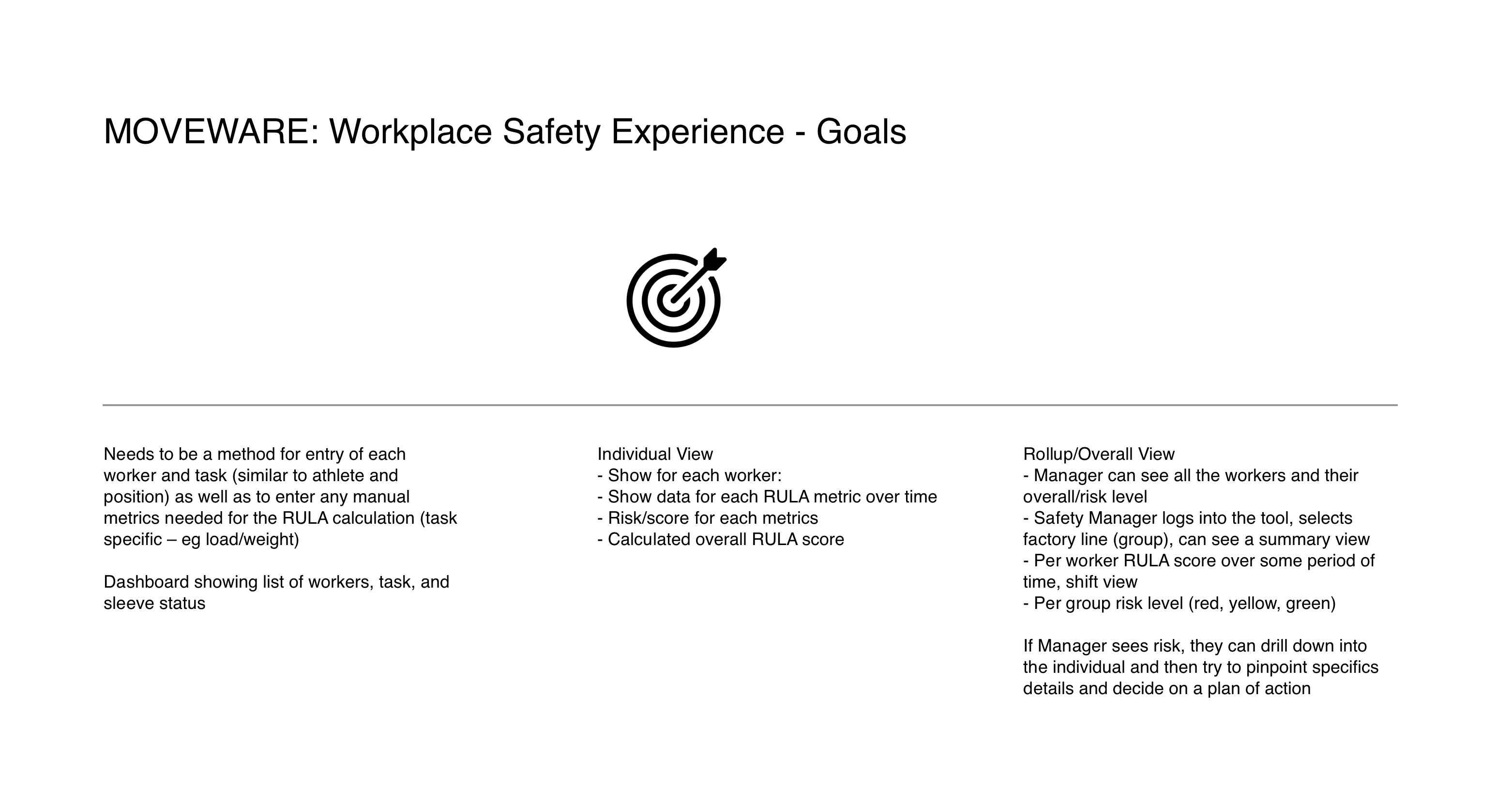
Before any screen was designed, I worked with the Liquid Wire team to define exactly what the platform needed to do at each level of the organization. The goals brief clarified the three-layer architecture that shaped everything that followed: data entry and sleeve status for individual workers and tasks, an individual view showing RULA metrics and calculated risk scores over time, and a rollup view where a safety manager could see all workers at a glance — then drill down into anyone flagging risk.
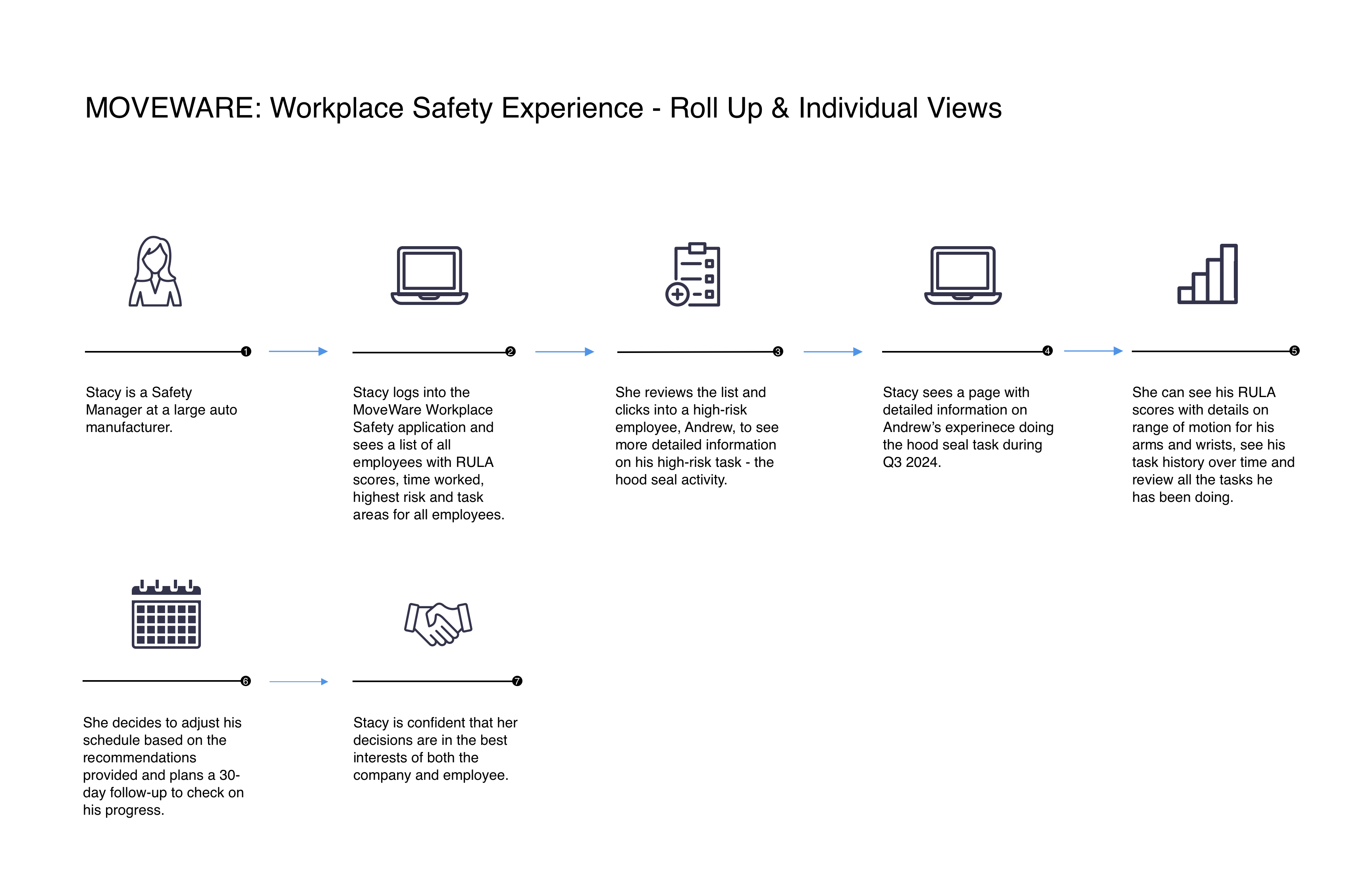
With the platform logic defined, I mapped the primary user scenario into a concrete workflow — following a safety manager named Stacy through a realistic use case from login to action. That scenario became the design brief that grounded every subsequent decision.
- Designed individual employee risk profiles: arm posture score with left/right breakdown, wrist flexion, wrist twist, upper/lower arm metrics — all against safe range with a four-tier severity system (green → yellow → orange → red)
- Built task-based monitoring so risk was assessed in the context of what the worker was actually doing — task, repetition count, and duration all factored into the threshold logic
- Designed action item recommendations tied directly to out-of-range readings — specific task substitutions that keep the worker productive while reducing re-injury risk, not generic alerts
- Built flexible temporal filtering — Today, Last Quarter, This Year, custom range — so the same interface serves a manager checking yesterday's incidents and one reviewing a quarterly compliance report
- Designed workforce filter states that map to real operational contexts: New Employees, Disabled, Modified, Claim(s) Submitted, Disability Leave, Monitored — each a different workflow lens on the same employee list
- Built group management views filterable by department, work group, task type, and return-to-work stage; high-risk and medium-risk surfaced without the manager having to hunt
- Designed the executive summary rollup: trend lines, quarter-over-quarter and year-over-year comparisons, assessment counts, injury claim volumes — exportable to CSV for integration with existing HR and compliance systems
The work
Platform goals brief — the architecture before the architecture
The goals brief codified three distinct view types that became the platform's structural spine: individual worker entry, individual risk view, and rollup/overall view. Critically, it also defined the workflow logic — manager sees risk at the group level, drills into the individual, pinpoints specifics, decides on a plan of action. That drill-down path wasn't just a feature. It was the primary use case that every screen had to serve.
Primary user journey — from group overview to individual action
Stacy is a safety manager at a large auto manufacturer. She logs in, reviews the employee list, clicks into a flagged worker doing a high-risk Hood Seal task, sees his detailed risk profile, reviews his arm and wrist scores over time — and makes a scheduling decision she's confident is right for both the worker and the company. Seven steps. One continuous flow. The platform's three screens map directly to steps 2 through 5 of that journey, and the design had to make that progression feel inevitable, not effortful.
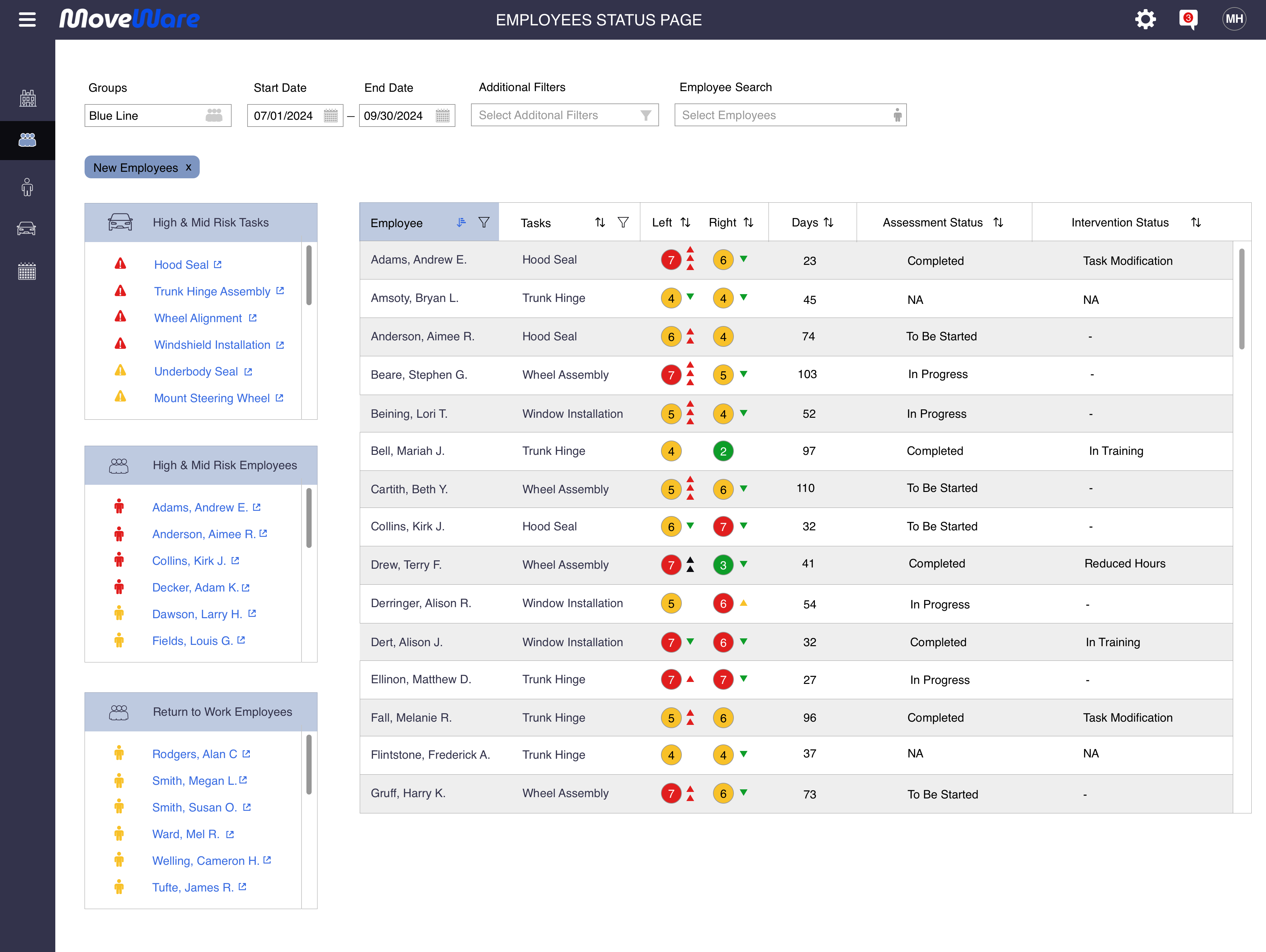
Employee Status Page — The safety manager's primary workspace
The Employee Status Page is where Stacy spends most of her time. The full workforce is visible in a single list — each employee showing their highest-risk task, left and right arm scores with trend arrows, a time chart of risk history, days monitored, hours worked, and percentage of risk days. The sidebars surface the most important signal immediately: High and Mid Risk Employees on the right, High and Mid Risk Tasks below that. Normal workers disappear into the list. Workers who need attention surface without the manager having to hunt. A risk score tooltip surfaces both the current value and the percentage above that worker's own historical average — the difference between knowing someone is in the red zone today and knowing they're trending worse. That distinction determines whether this is a monitoring situation or an intervention situation.
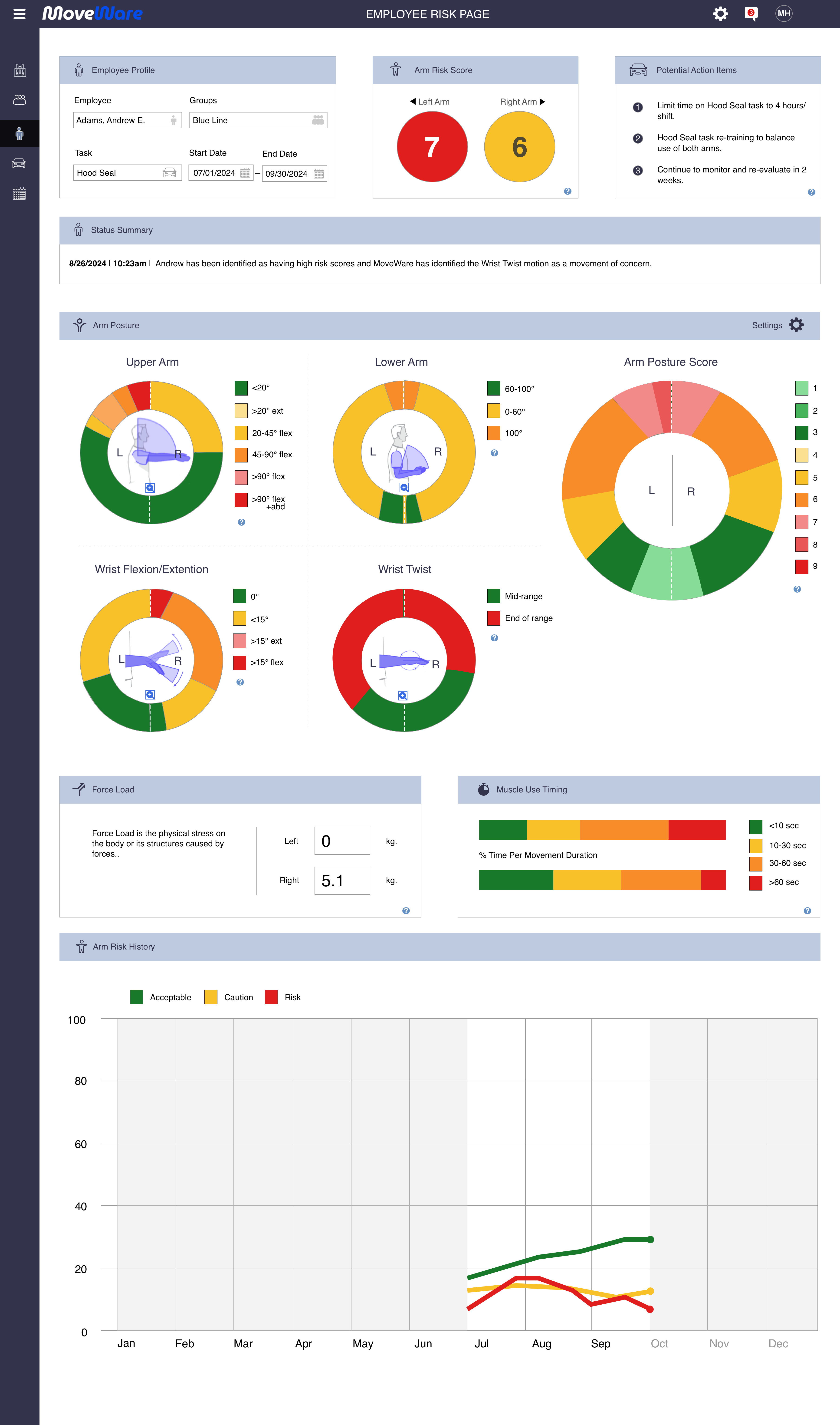
Employee Risk Page — The full picture on a single worker
When Stacy clicks into Andrew Adams from the Employee Status Page, this is what she sees. The profile header anchors everything to context: employee, group, task, and date range. The arm risk score leads — left and right displayed side by side so asymmetry is immediately visible. Below that, the full RULA breakdown: upper arm position, lower arm position, wrist flexion/extension, and wrist twist — each shown as a proportional donut chart with color-coded severity bands, both arms simultaneously. Force load shows the physical stress differential between arms. Muscle use timing shows what percentage of movement duration is happening in each time band. The arm risk history chart shows how acceptable, caution, and risky distributions have shifted over the entire monitoring period. Three numbers in the action items panel tell the manager exactly what to do: limit Hood Seal to four hours per shift, re-train to balance arm use, re-evaluate in two weeks.
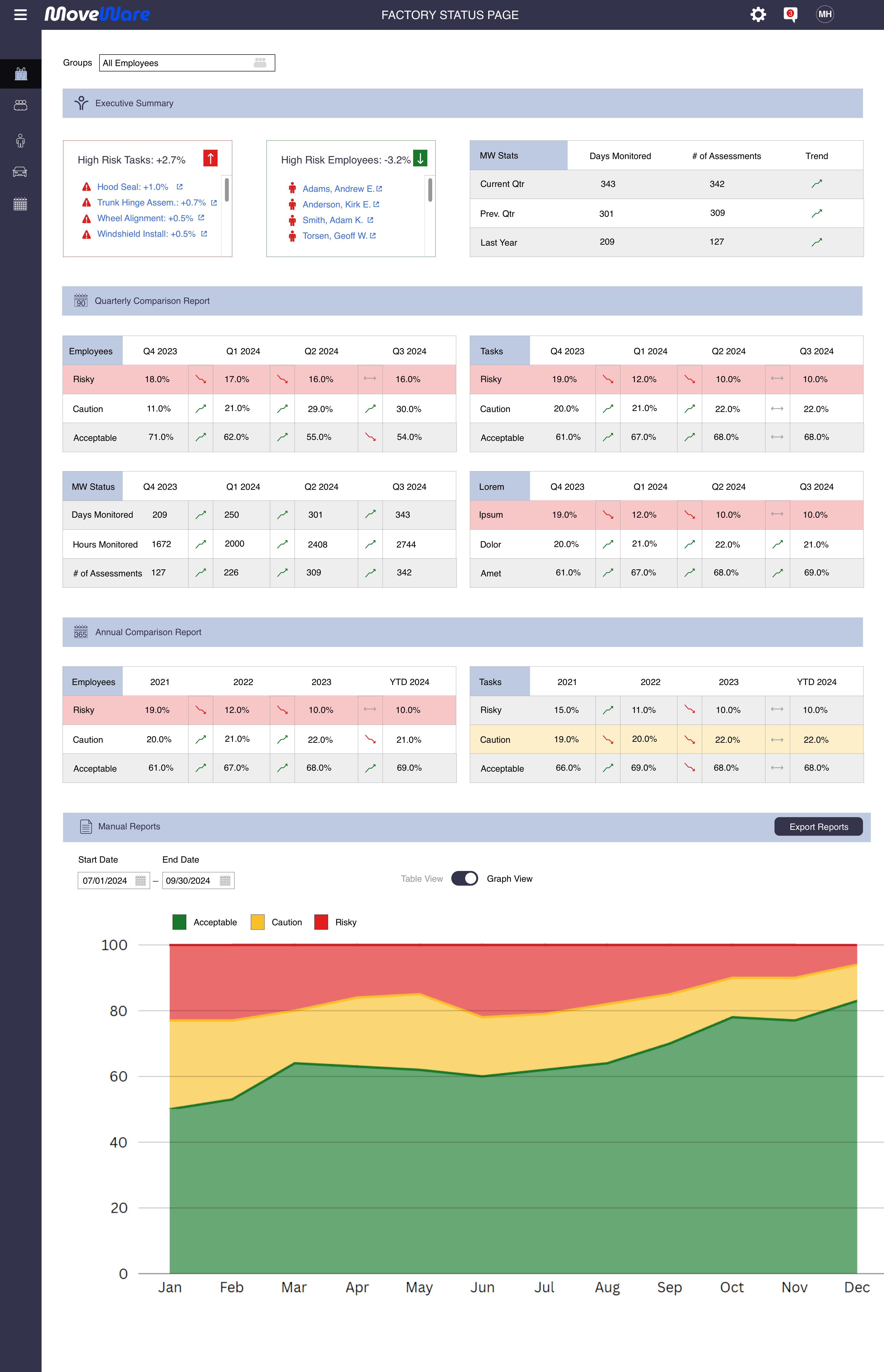
Factory Status Page — The executive's question answered
The Factory Status Page answers a fundamentally different question than the Employee Status Page: not "who needs attention today" but "is the program working over time." The executive summary surfaces the highest-risk tasks and employees with trend indicators — Hood Seal up +1.0%, Trunk Hinge Assembly up +0.7% — alongside the high-risk employees driving those numbers. The quarterly comparison report shows risky, caution, and acceptable distributions across Q4 2023 through Q3 2024. The annual comparison extends that view across four years. Days monitored, hours monitored, and assessment counts give leadership the program utilization data to justify continued investment. Reports export to CSV for integration with existing HR and compliance systems. This is the view that turns individual risk data into organizational evidence.
Designing for defensibility — the severity system
One of the more consequential design decisions was the severity color system. Green through red sounds simple. In a workplace safety context with injured workers and legal liability attached, it isn't.
Green means the worker is within safe range for this motion at this volume. Yellow means they're approaching the boundary — trending toward it. Orange means they've exceeded normal range — action recommended. Red means they're significantly out of range — intervention required, not suggested. Each level needed a corresponding action item, not just a color. A severity rating without a recommended response puts the burden back on the manager to figure out what to do — which is exactly the problem the platform was supposed to solve.
The action items were designed to be task-specific. If a worker doing door hinge assembly in an auto plant can safely perform that motion five times before fatigue degrades their range, the system flags it at five and recommends rotating them to a different station — keeping them productive, keeping them safe, and creating a documented record that a decision was made and why. In workers' compensation environments, "we monitored it and acted on the data" is a meaningfully different position than "the supervisor thought they seemed okay."
Where the project landed
The design was completed. The contract ended before field testing began — but only just. Liquid Wire had meetings scheduled the following day with two auto manufacturers and a shipping company to present the platform as a proof of concept. Simultaneous pilots across different industry verticals, running in parallel with the athletic platform rollout. The timing was tight and the pipeline was real.
It didn't happen. Same outcome as the athletic platform — shelved before it reached users. The workplace safety application was never taken further.
The market timing may have been the limiting factor. Auto manufacturers and logistics companies willing to instrument their workforce with wearables and integrate a new monitoring platform into their safety programs — that's a significant organizational commitment. The technology was ready. Whether the industry was ready to adopt it at that speed is a different question.
What this taught me
The workplace platform crystallized something I've seen across a lot of enterprise work: the further up the organizational hierarchy your users are, the more they need trends rather than data points. A safety manager needs to know whether a specific worker is safe to keep doing a specific task right now. An executive needs to know whether the program is working over time. Same platform, completely different questions. Designing for both simultaneously requires a hierarchy where each user finds their answer without wading through everyone else's data.
The action item framework reinforced a principle I'd apply to any monitoring tool: an alert without a recommendation is just anxiety in a different color. The tooltip showing Andrew Adams' left arm score is 18.75% above his own average isn't just a data point — it's the difference between "this number is red" and "this person is trending worse and needs a specific intervention." The design that earns trust isn't the one that tells you something is wrong. It's the one that tells you what to do about it — specifically, in the context of the task, the worker, and the threshold that was crossed.
The same problem in a different domain
The athlete and workplace platforms ran in parallel on the same hardware — different users, different stakes, the same fundamental challenge. The athlete platform is the other half of this story. Ready Rebound applied similar thinking to municipal return-to-work management.
View MoveWare Athlete → View Ready Rebound →